
design rationale
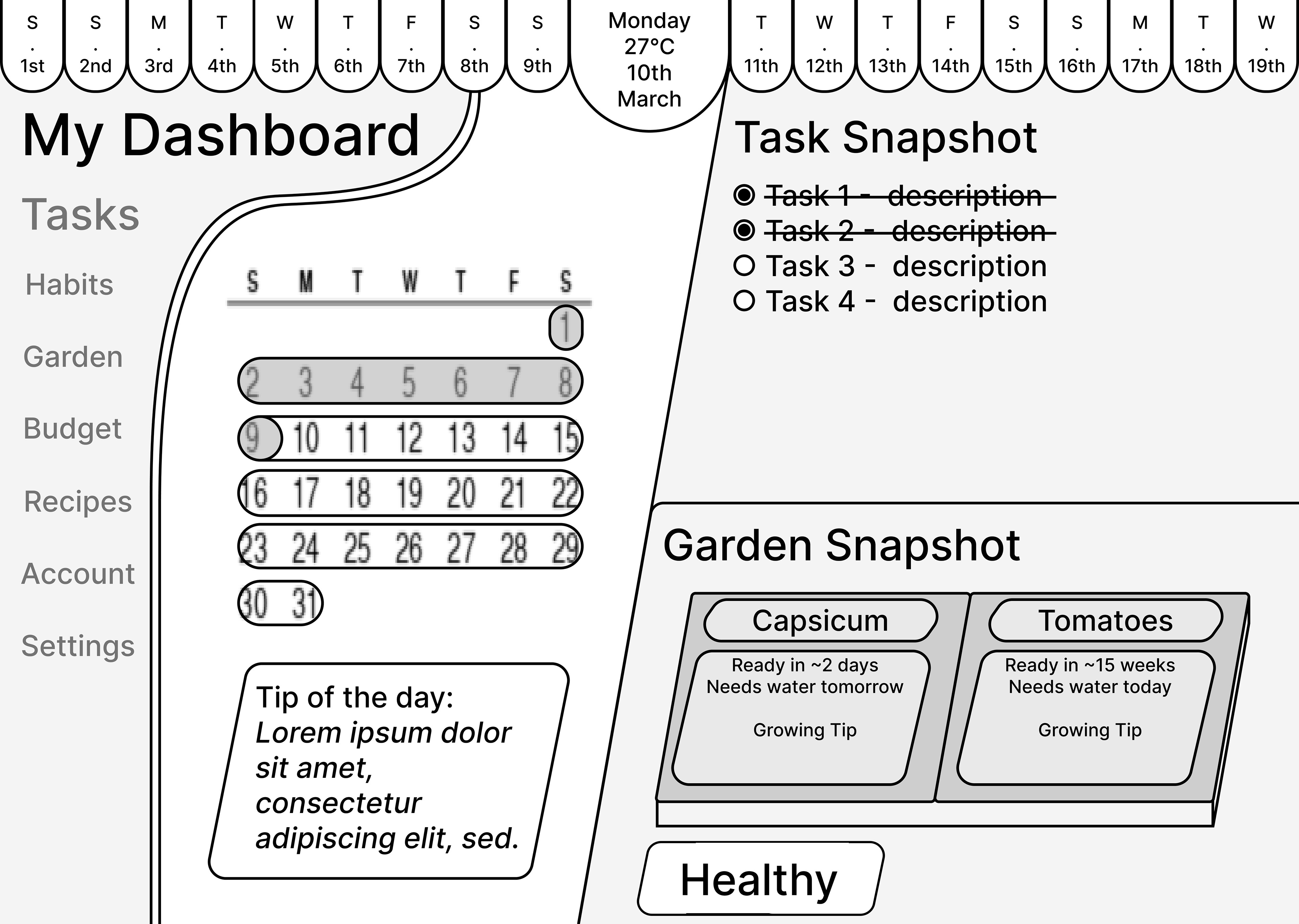
First Wireframe
- Played with unique top-bar style calendar.
- Diagonal lines and sidebar bulge created a messy UI.
- Having a top and side navigation confused test users.
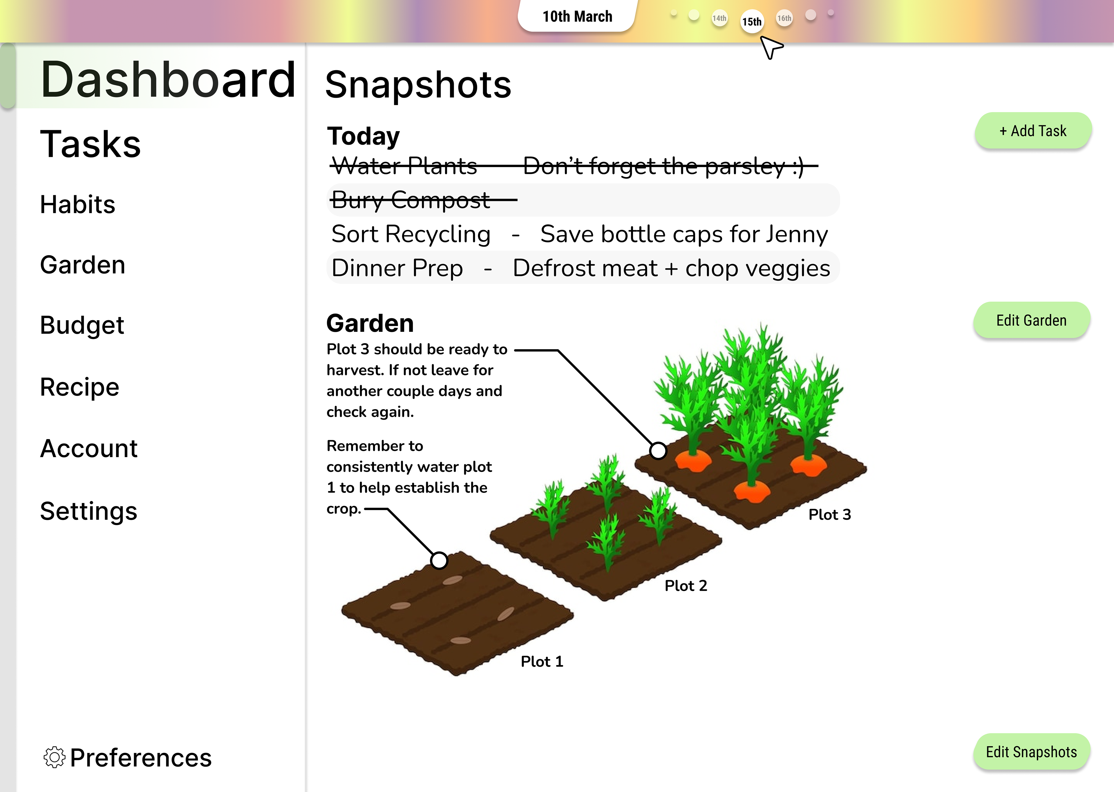
First Prototype
- Refined the navigation bars and re-envisioned the horizontal calendar using colour instead of form.
- Colour however then became an issue with the brand colours conflicting with the calendar colours.
- Sample illustrations were included to liven up the graphic devoid UI.
Second Wireframe
- Building upon the first prototype the calendar was scrapped in favour of a stronger sidebar navigation.
- Inspired by ideas discovered early in the design, the UI design shifted towards modular snapshots and info panels.
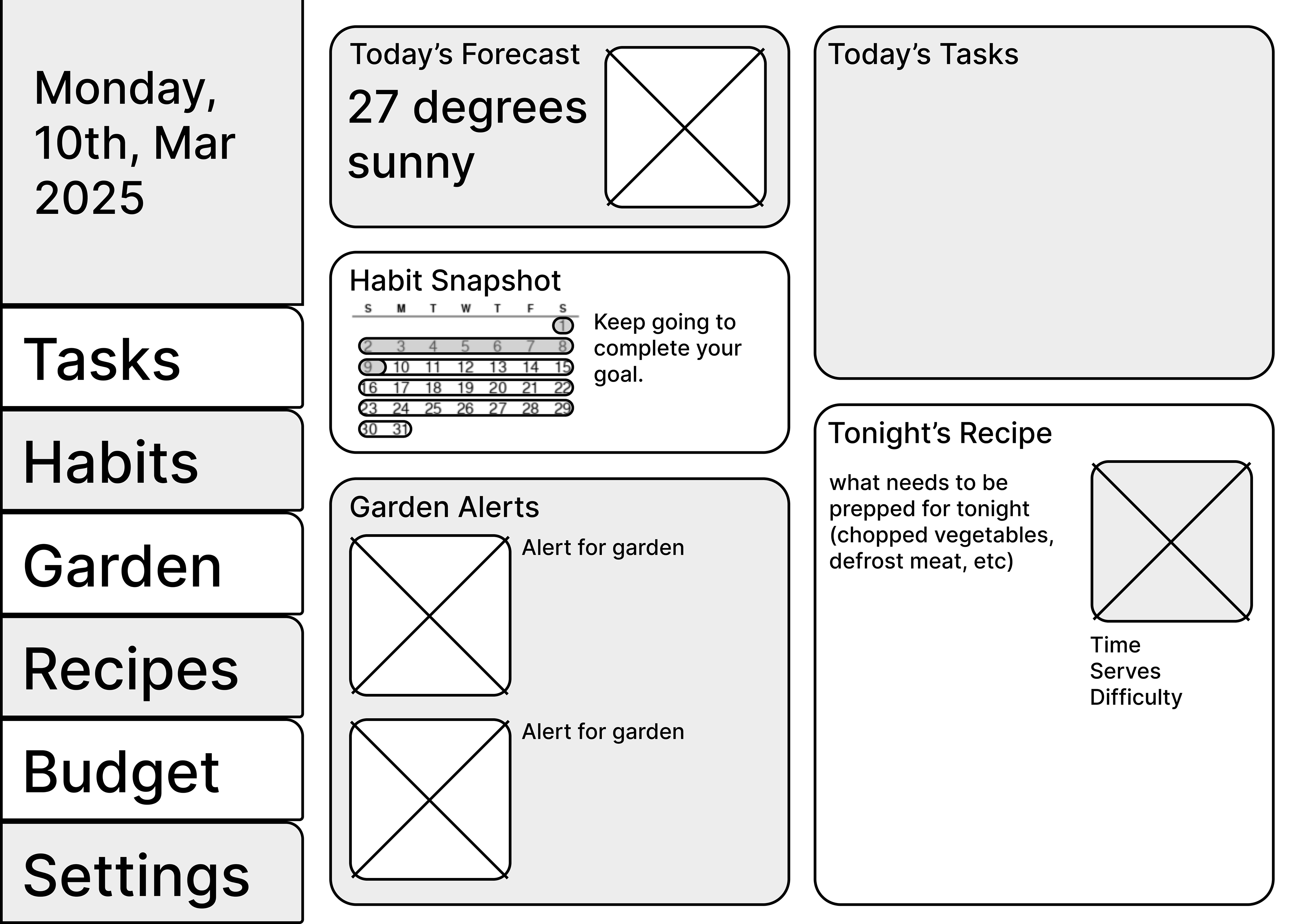
Second Prototype
- The prototype started to develop how to distinguish panels from background through drop shadows.
- The sidebar was changed to feature symbols instead of text utilising semiotics to transcend language.
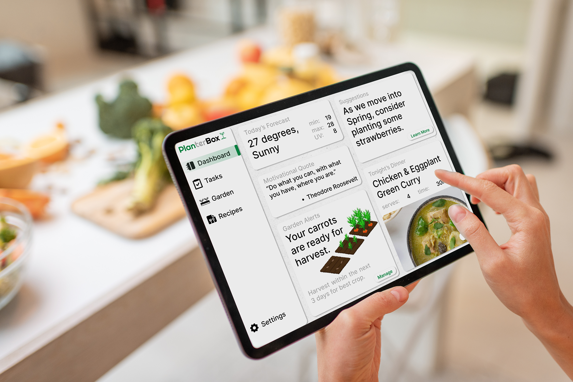
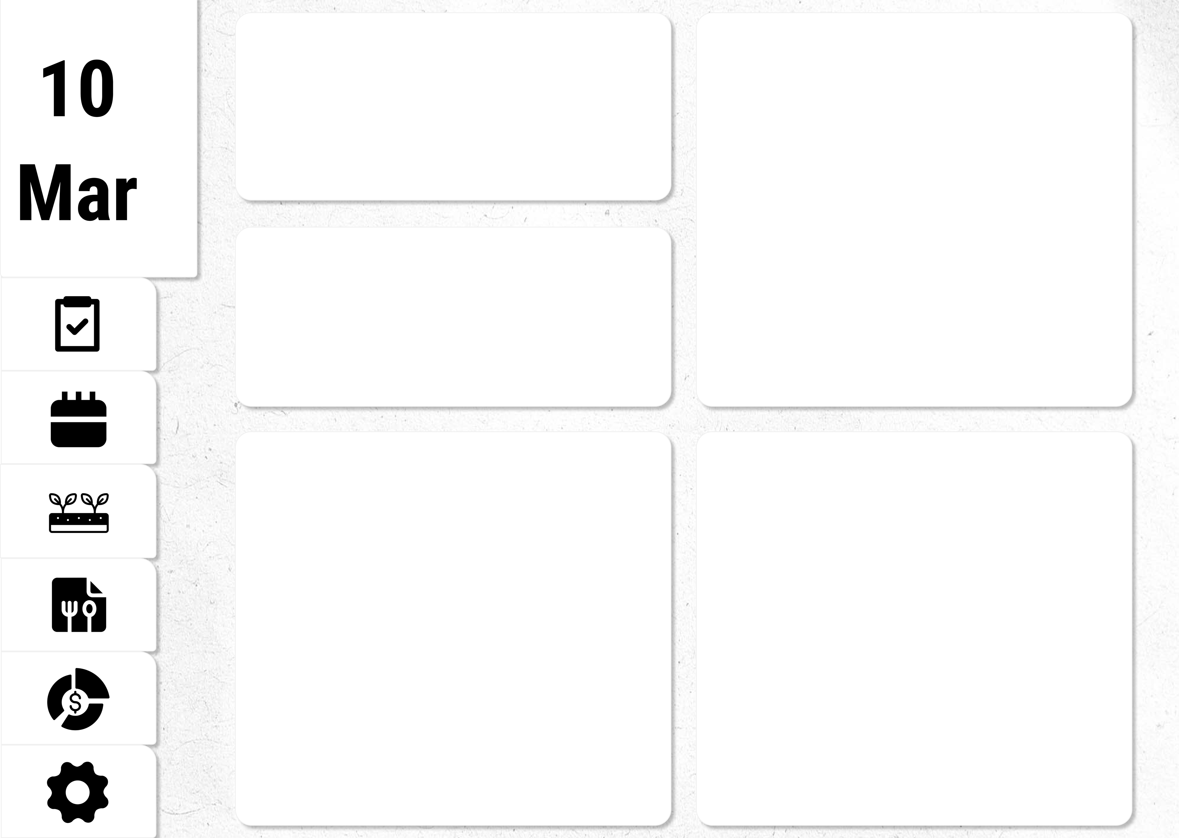
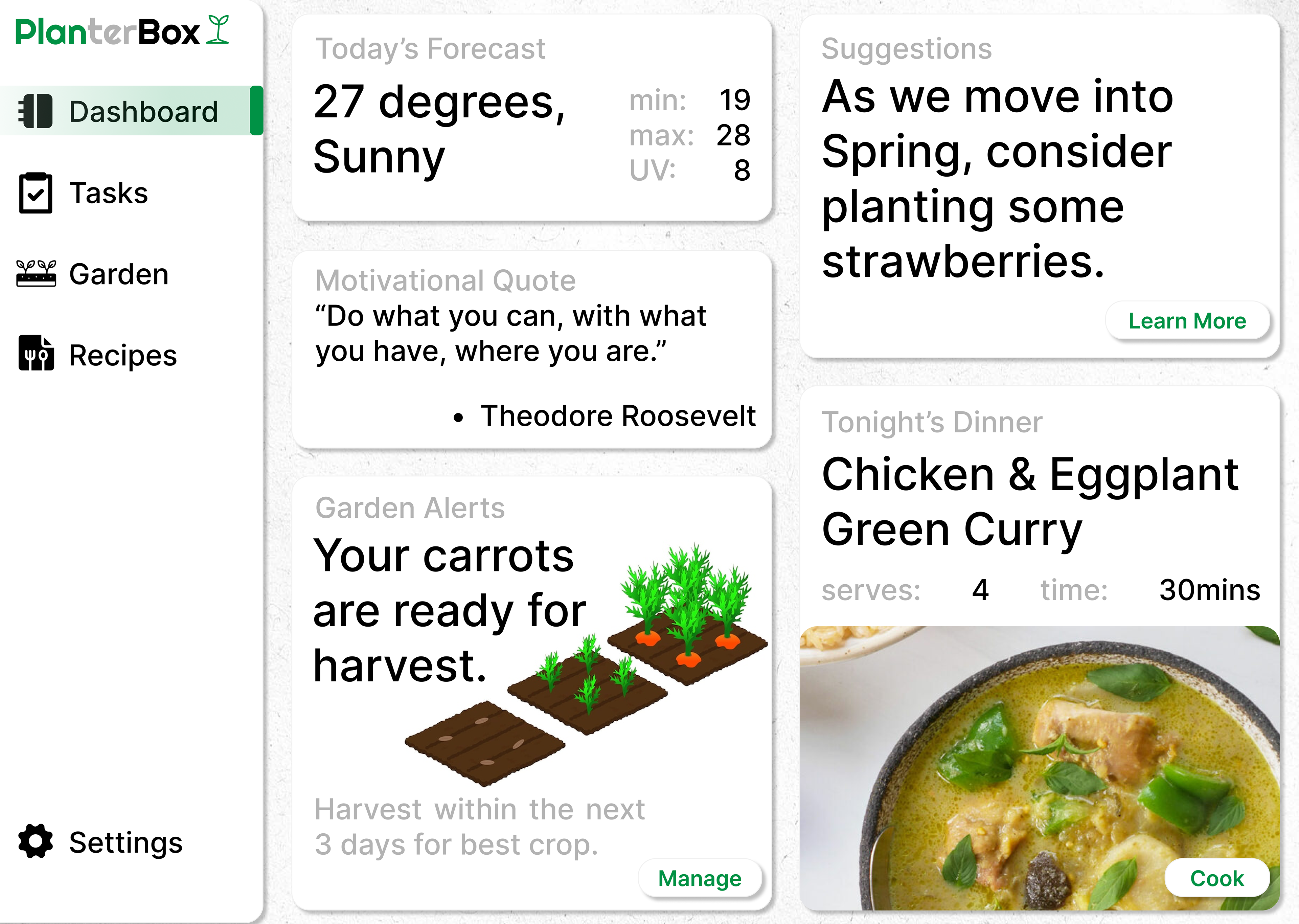
Final Prototype
Let's make something!